
Dashboards that help people find the answer faster.
We design reports and dashboards around the questions users need to answer, not around how many charts can fit on a screen.
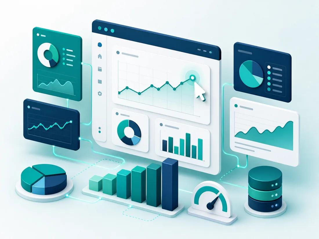
A useful dashboard is a decision tool, not a display piece.
We begin by defining the users, measures, comparisons and actions the dashboard needs to support, then create an information structure that makes the important signal easy to find.
Interactive Dashboards. Power BI, Tableau or custom web environments built for the decisions your stakeholders need to make daily.
Research Reporting. Trackers, brand health views, segment profiles and story-led reporting for ongoing survey programmes.
Data Modelling. Underlying structure, relationships, calculated measures and data quality checks prepared before build begins.
Handover & Adoption. User guidance, admin notes and walkthroughs so teams can use the output confidently.
Less decoration. More direction.
Colour, motion and visual density are used with restraint. The job of the dashboard is to guide attention and support a decision.
How the work moves
Discover
Users, decisions, data sources and reporting pain points.
Structure
KPIs, hierarchy, filters and the dashboard journey.
Prototype
Wireframes or sample views before full build.
Build
Develop, connect data and test the reporting environment.
Adopt
Launch, train users and refine based on real usage.
Why teams choose StatEdge for data visualisation
Decision-First Design
We start from the decision a dashboard needs to support, not the number of charts we can fit on a screen.
Any BI Environment
Power BI, Tableau or a fully custom web dashboard, matched to what your team already uses day to day.
Training & Handover Included
Every build ships with user documentation and a live walkthrough, so your team can operate it independently from day one.
Common questions, answered directly
Can dashboards refresh automatically?
Can we restrict access by user or region?
Do you build static reports too?
What drives the cost of a dashboard project?
Need clearer reporting for your research programme?
Tell us who will use the dashboard and what decision it needs to support.